


We're pretty used to seeing this kind of a map when it comes to displaying the results of the presidential election:
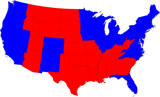
But we all know that, given the inherent biases of the standard map projection combined with our antiquated and non-democratic electoral college system, it's not a true representation of reality.
But all that has been solved by a guy named M.E.J. Newman over at the University of Michigan. Take a look at a cartogram that is much more representative of what really happened in this year's election, this one based on the relative strengths of the electoral vote:
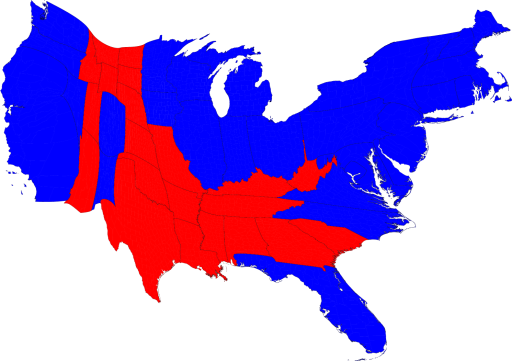
Big difference, huh? He has a number of other ways of graphically representing the electoral map, so check it out.
It will help you think outside the box when it comes to this kind of stuff, and kudos to Mr. Newman for providing it to us.


2 Comments:
What fun! And, a very informative way to understand how it all comes together.
Distortion in the service of TRUTH, for a CHANGE!
Post a Comment